
Taking the fear out of the first trade
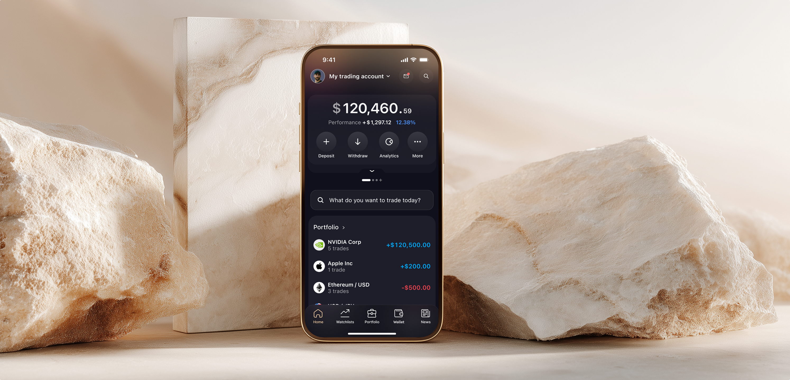

Capital.com is a high-volume trading platform where first-time investors and professionals trade side by side. The product was powerful but intimidating: leverage jargon, dense charts, and an account state only experts could read. I redesigned the core mobile journey, from the morning greeting to the moment a trade is placed.
Highlights
- Reworked onboarding and the first-trade journey
- Turned a high-pressure app into a calmer first experience
- Made margin risk legible at a glance
- Designed conversational insights that turn questions into confident trades
The system
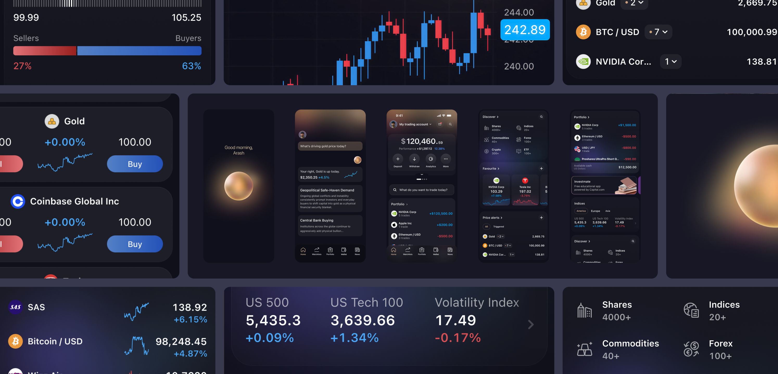
One design language, from first glance to fast markets.
Charts, instrument cards, watchlists, indices, news: every surface a trader touches was rebuilt as one family. The same component holds a beginner buying their first share of gold and a professional scanning volatility before the open. Consistency is what lets density feel calm, and calm is what keeps a first-time trader in the room.
The best risk warning is an interface you can actually read.
Margin clarity
Making risk legible at a glance.
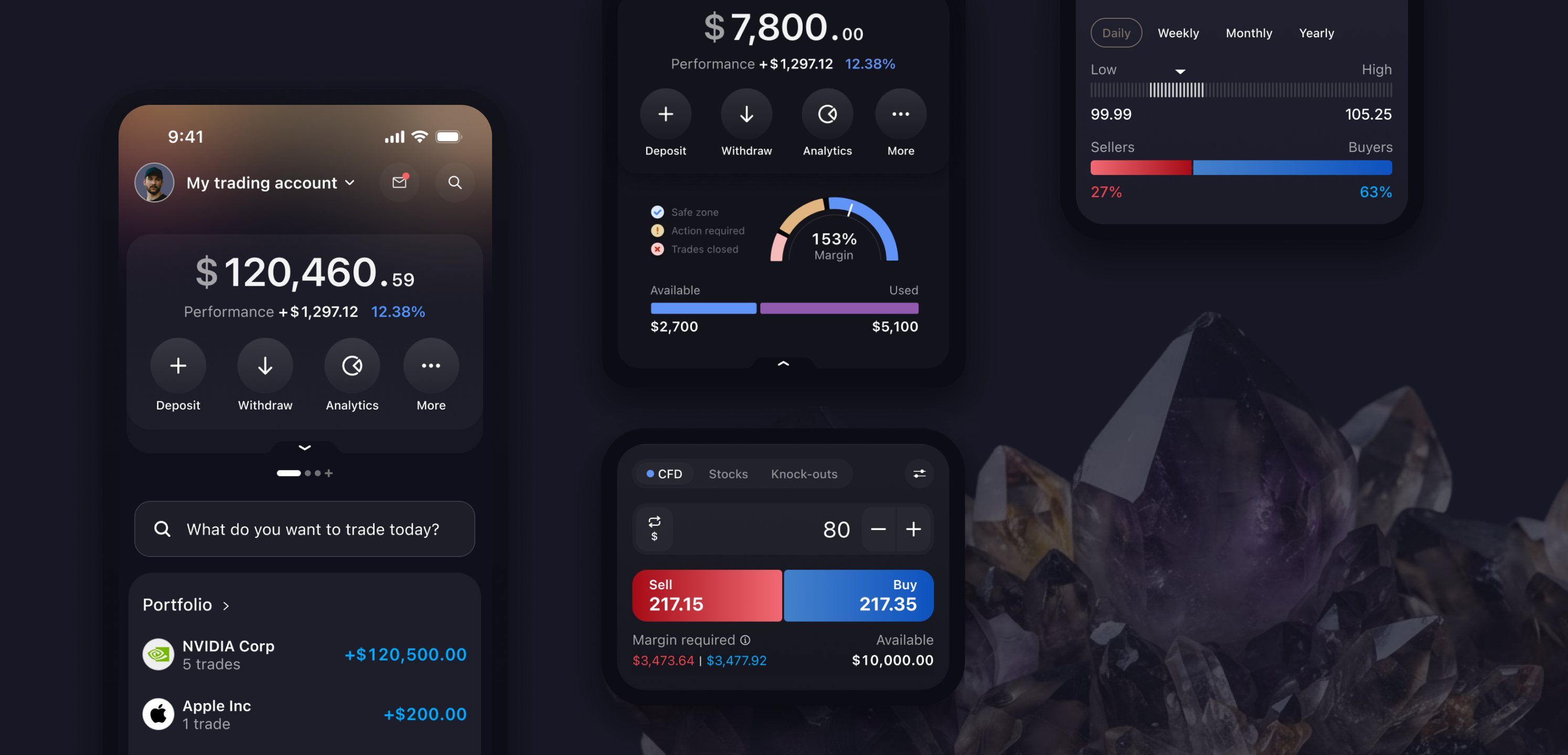
Margin was the moment the platform lost people. Percentages sat against dollar figures, statuses crowded the display, and the one question that matters (am I safe, or about to be closed out?) had no clear answer. I iterated the account header from mismatched numbers to a single gauge with safe, action and closed zones, backed by plain available and used bars. Account risk became readable in one glance, on the same screen as the ticket where it matters.
Conversational insight
Ask a question. Understand the market. Act.
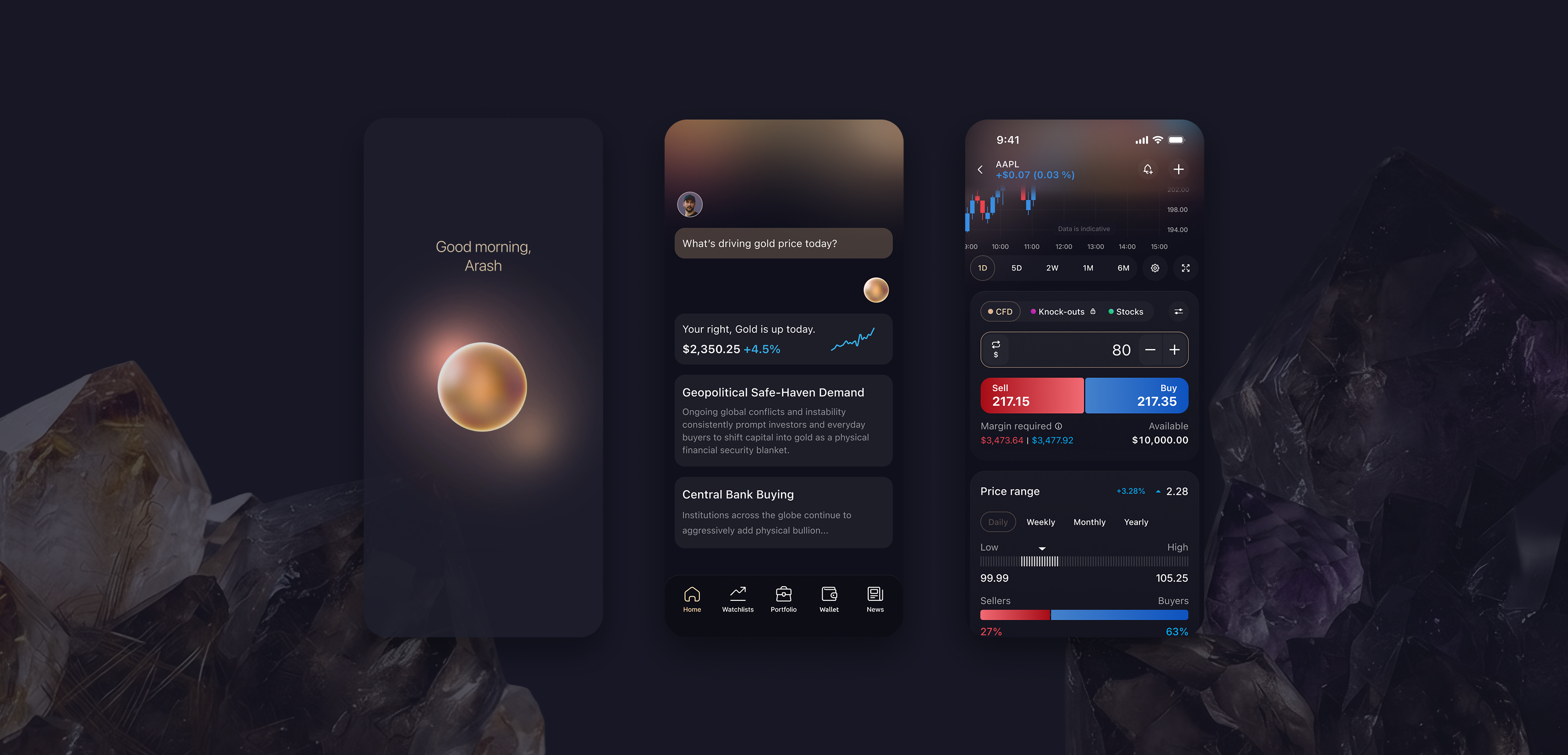
The journey opens with a greeting, not a chart. A trader asks what is driving the gold price today and gets a plain-language answer: the price, the move, and the two forces behind it. The insight lands one tap from the ticket, so understanding flows straight into action. Questions become considered trades instead of abandoned sessions.
Outcomes
Confidence, designed in.
The reworked onboarding and first-trade journey took the intimidation out of the platform's most fragile moments: the first session, the first question, the first trade. Beginners got a way in that never punished them for being new, and the same clarity served professionals moving fast. A trading app that beginners trust is one professionals enjoy, and the design held for both.
More work
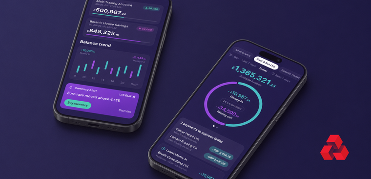
That same push, taking something dense and high-stakes and making it calm and legible, carried into rebuilding a bank for mobile.
A few quicker wins


© 2026 Arash Lowni