
Shaping cyber security learning for 7M users
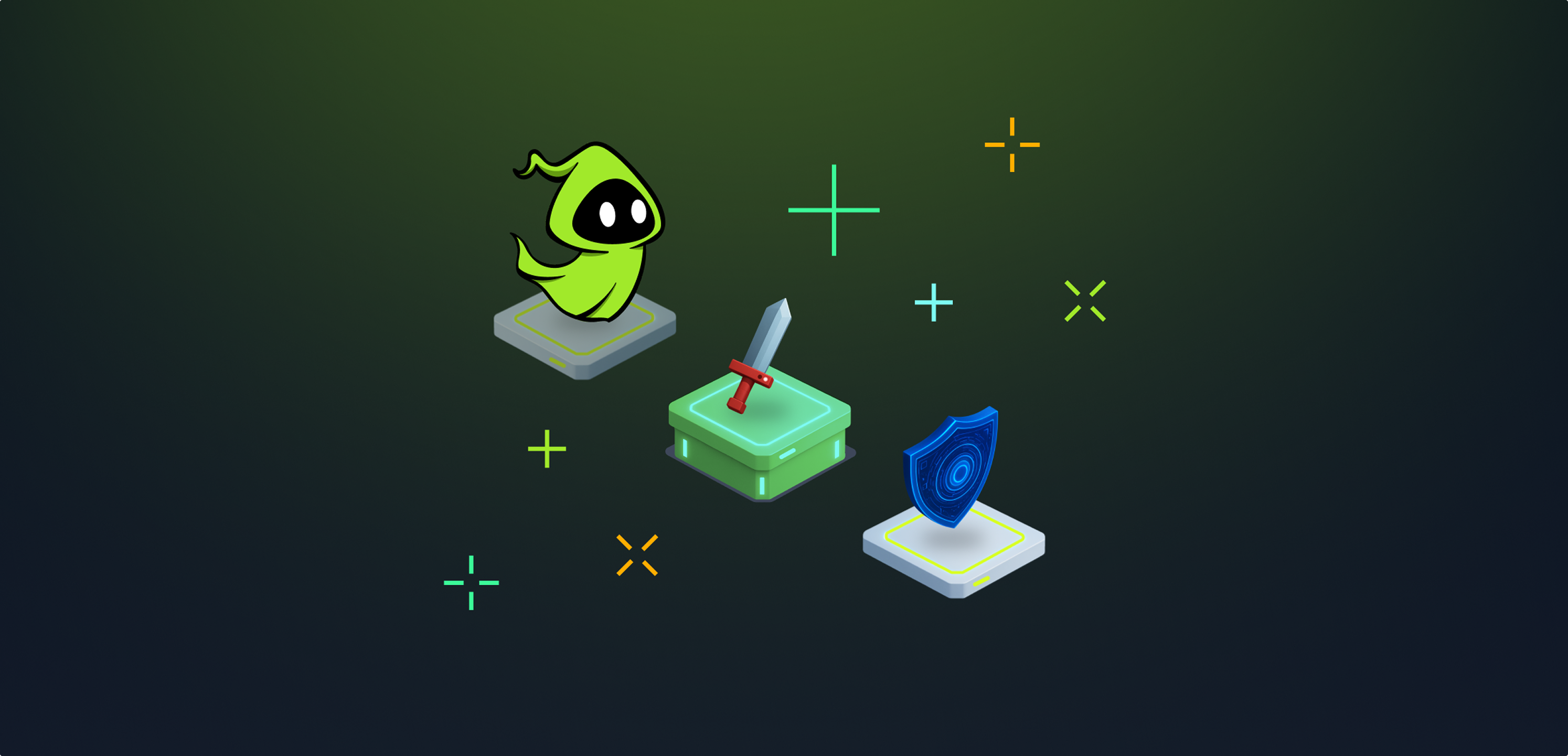

TryHackMe teaches cybersecurity through hands-on labs. At seven million users, the platform was leaking at almost every stage: activation was weak, learners were dropping off mid-room, and the gamification was surface-level rather than structural. I joined as lead product designer across multiple squads over a period of 12 months.
Highlights
- Led design strategy across multiple squads
- Launched a gamified learning path to seven million users
- Personalised onboarding that got new learners to a real first session
- Redesigned numerous room experiences to lift room completion
- Designed the weekly missions system, shipped and growing
Gamification
Building the path people actually want to follow.
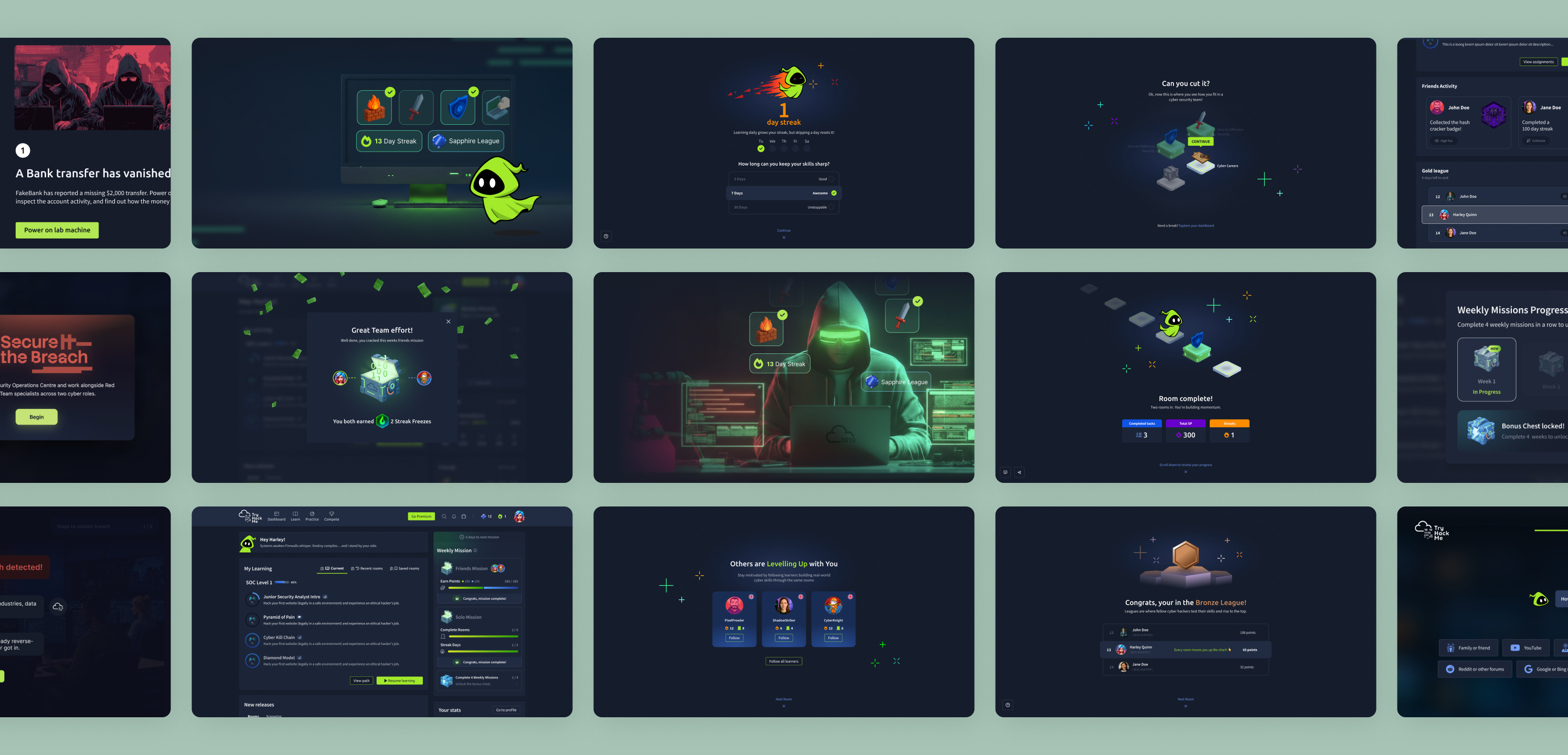
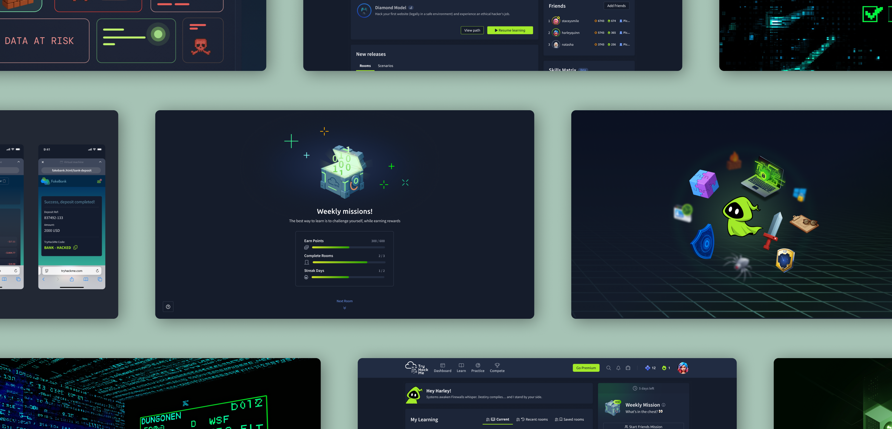
Moving TryHackMe from a catalogue of rooms to a genuinely gamified journey required three things: a visual path, a character learners could attach to, and rewards that felt earned. I pushed for a mascot-led system because the path needed an emotional anchor, drawing on what Duolingo gets right about habit, encouragement and return visits. The strongest direction shipped to every learner, supported by a complete room-state system and icon library across every learning topic.
Fast small failures gave the team the confidence to make the structural changes that actually moved the numbers.
Activation
Getting the right learner to the right start.
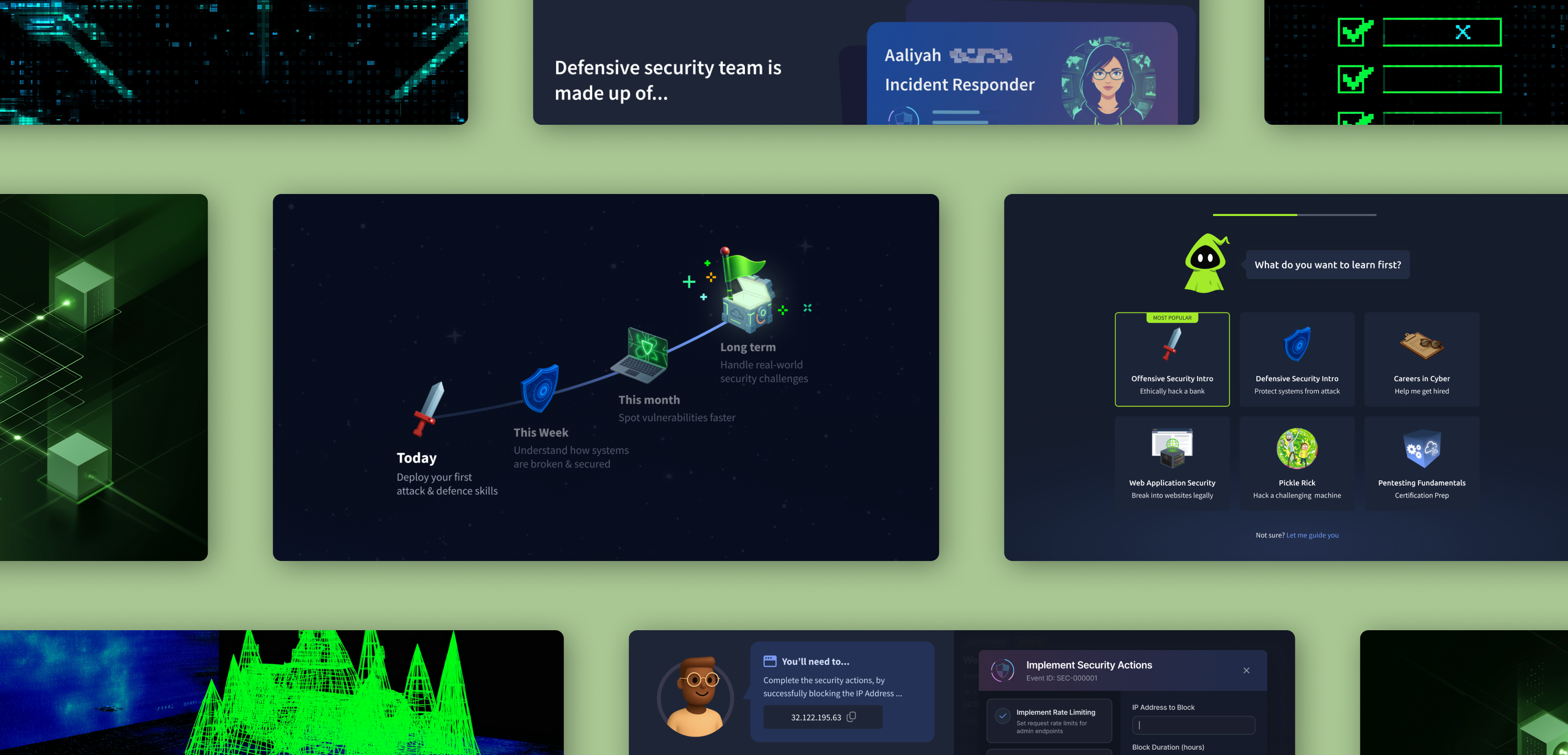
Different learner types arrived with completely different goals, but one generic onboarding served them all. I designed an AI-assisted segmentation flow: a conversational enrol path that reads intent and routes each person to the right first session, then maps the week and month ahead. Sign-ups became learners who came back for the next room.
Learning experience and engagement
Fixing how the platform teaches. Then keeping people coming back.
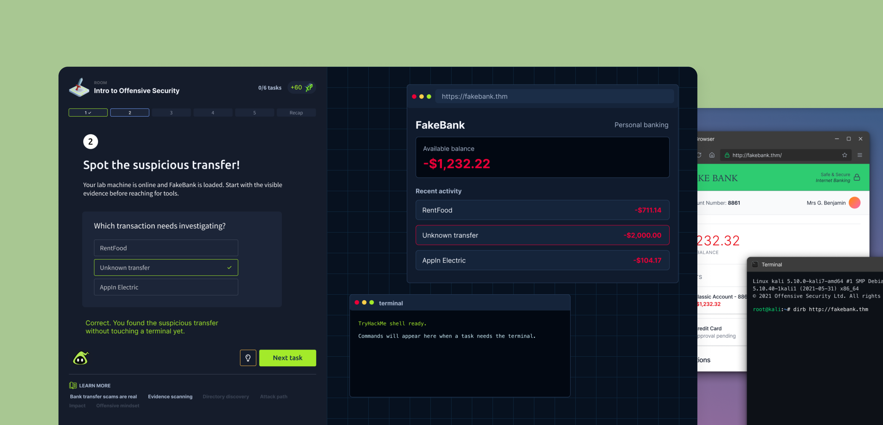
Learners were dropping off at task two and three, not because the content was too hard, but because the room gave no sense of progress. I redesigned numerous room experiences to make momentum visible, exploring ideas like task pagination that give a clear signal at every step. That work was instrumental in lifting room completion.
Once learners could see their progress inside a room, the next question was how to earn the return visit. Missions turned progress into a weekly loop: clear goals, visible rewards, and a character that celebrates the moment momentum starts to build.
Outcomes
Shipped. Measured. Repeated.
The gamified learning path shipped live to all seven million users. Personalised onboarding lifted activation. Redesigning the room experience was instrumental in lifting completion, and the weekly missions system shipped and kept growing. Fast, low-risk experiments gave the team confidence to make the bigger structural changes that landed.
More work
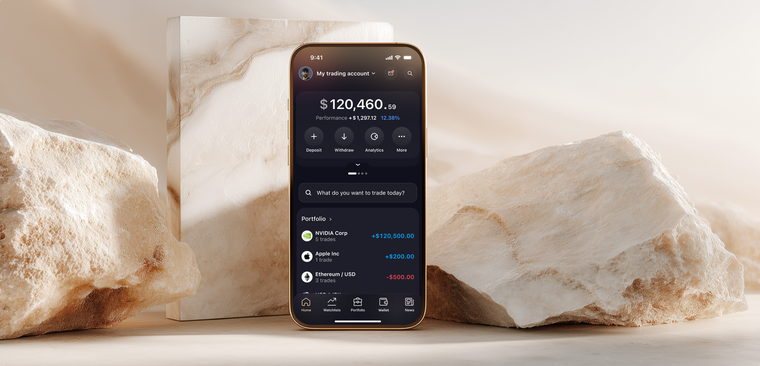
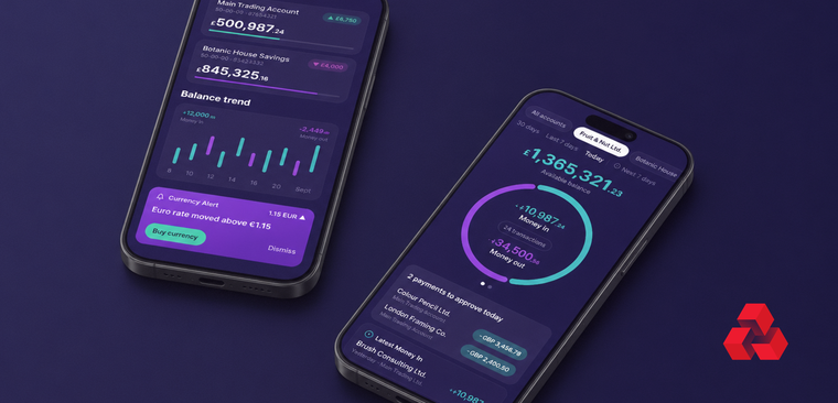
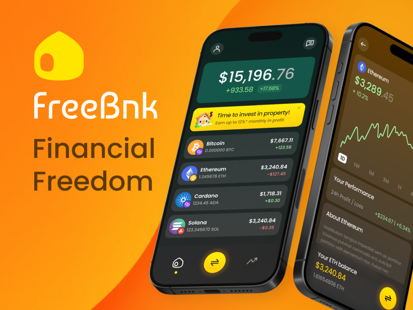
If making something intimidating feel human is the thread, it runs straight through the fintech work too.
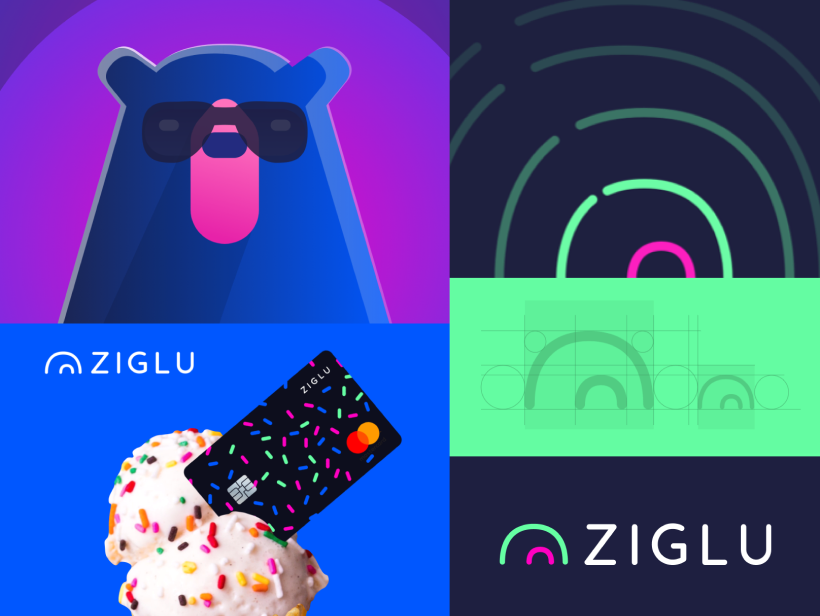
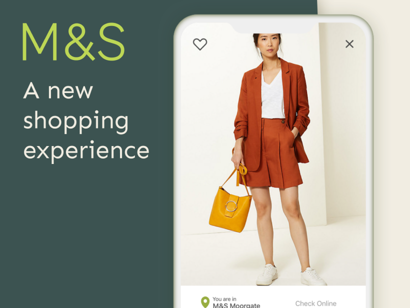
A few quicker wins
© 2026 Arash Lowni